We all want to publish the websites we create as quickly as possible after we finish working on them, and that generally comes at the expense of leaving out some important UX factors that negatively impact how users navigate the site after it gets online.
The problem is, in taking a few pre-launch shortcuts, we risk permanently losing long-term users over UX mistakes we could have fixed in an hour or so. Here are a few 'low hanging fruits' that can have a fast UX impact.
1. Don't force the user to do the math
Scenario: "Is this a new post?"
We've all been here: You are trying to find whether the post you're reading was published today, yesterday or last week, so you hunt around the page until you finally find a publish date – 20 November.
Ok, great – but now you're blanking what today's date is!
So, now you're off clicking on your laptop's clock function to work out when was the post published in relation to today. You spend time doing time math.
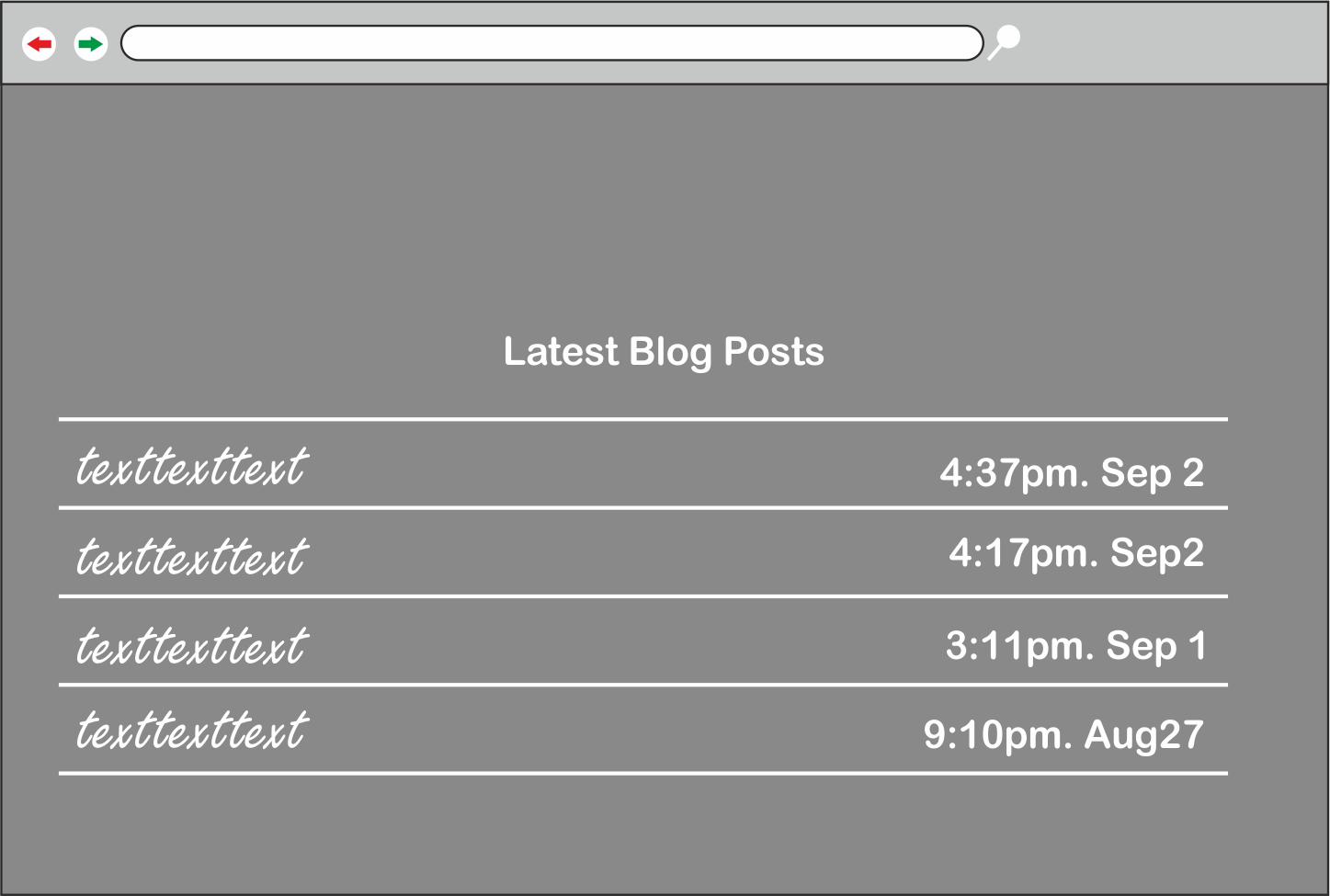
Solution
We can make this simpler with the use of 'relative timestamps' instead of showing the date and time a blog post was published at, we'll use how long ago it was published, (e.g 2 days ago, last week …) these do improve your UX but you need to use them carefully, since saying 1 year ago is really not a good idea. A good rule of thumb is if it is older than a week then switch to Absolute timestamps.

2. Use natural text instead of DRY language
Scenario
You've very likely come across and even subscribed to a newsletter online, how was your experience when filling out the form? I am sure it was pretty plain. As it was just Name: and E-Mail: you fill them out and agree to the terms and submit.
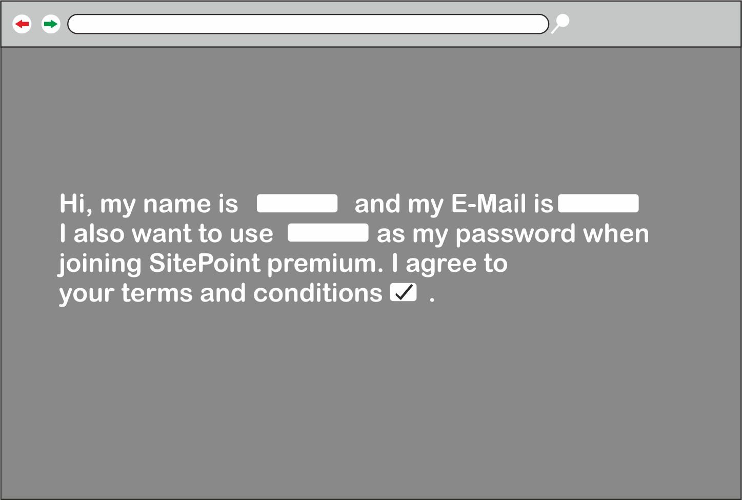
Wouldn't it be better if the actual form was a bit more natural? Take a look at the following image.

Looks rather plain and robotic.
Solution Let's solve that and make it more conversational. Instead of using the classic form style, try incorporating your fields into the text paragraph. Looking at the next image, you can see that the form itself is easier to skim over and fill in the necessary information, without sounding too formal!
3. Ignite the curiosity of the reader
Scenario
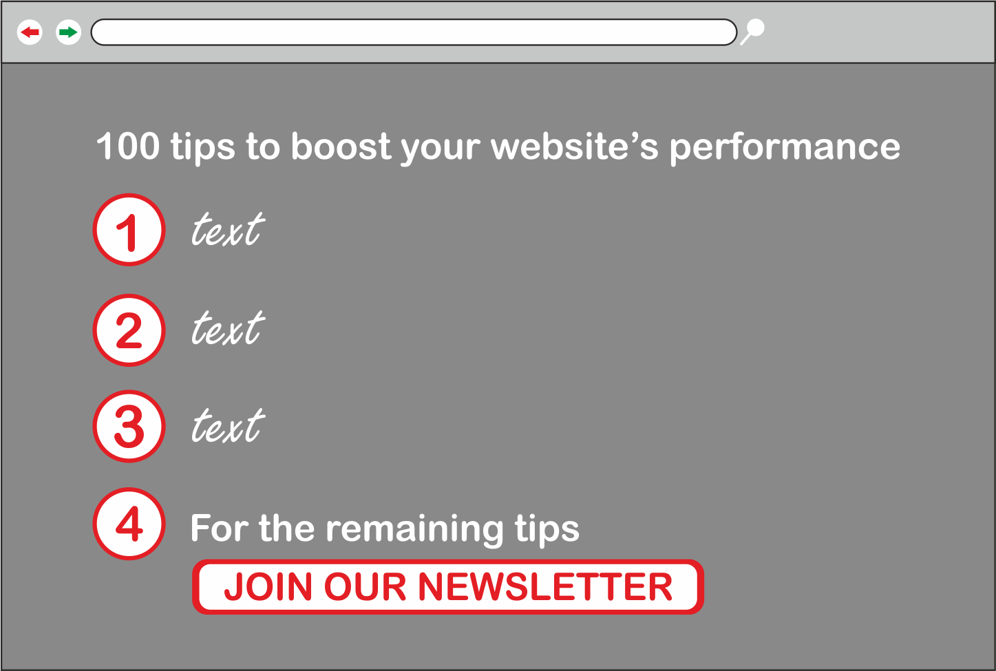
How many times you've came across a website that offers an eBook containing useful tips? I'm guessing too much! Unfortunately, there is a big issue with such sites. You want to be able to check a couple of tips from the book before downloading/buying it, and you come across some website that just says To view the tips please download our book!
Which sounds fishy 90% of the time. We've all been through that moment where we download a book and the information it contains is exactly the same as the one we read before it, which really results in a bad experience for you.
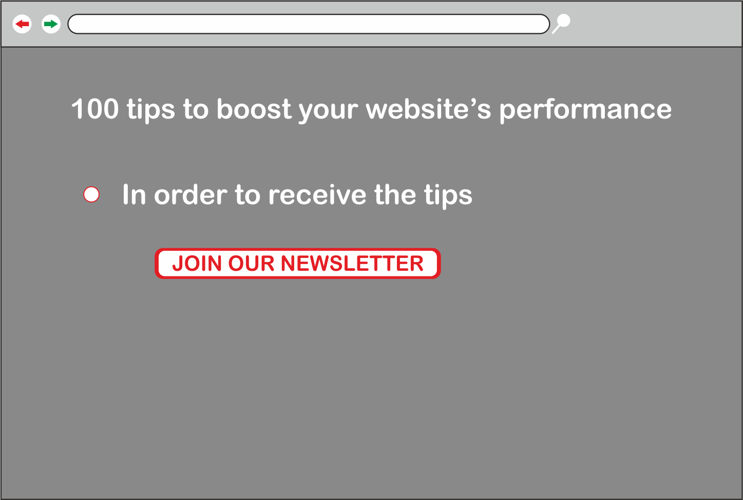
Solution Curiosity is an important emotion in human beings and as a Web Developer / UX Designer, our job is to put those emotions to good use. When we are curious we tend to take the next action with little to no thinking. So summing it up, by just listing 3 to 5 tips from your eBook for free in the buy / download page your users know the differences you offer from the rest and will want to know more.
4. Talk about the benefits of your app – not the features
Scenario:
You come across an application's website, you want to know how this application will help you but it only displays the features of the application.
For instance helps reduce your taxes isn't nearly as useful as saves you money, and uses NodeJS on the back-end isn't useful as Makes your workflow faster. As a daily user you don't care what technologies a specific application uses, you just want to get your work done as quickly and as efficiently as possible.

Solution
Don't fill your application's description with geeky words like NodeJS, Angular, React, PHP since the majority of the users don't have a clue on what it means, instead, focus on the benefits it offers.

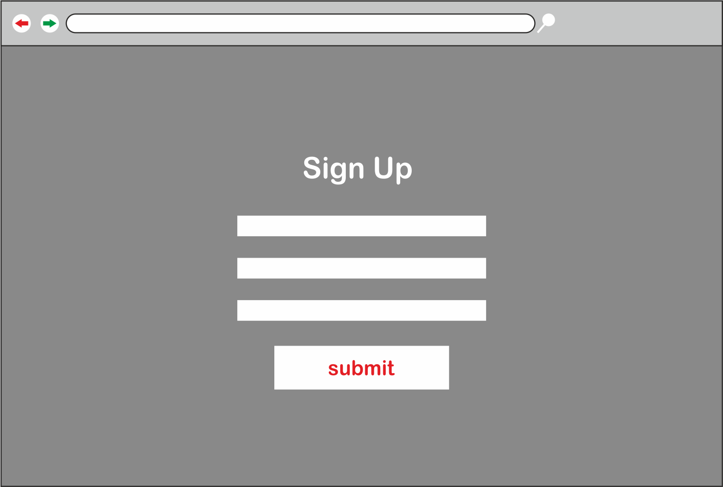
5. Increase your touch / click areas size
Scenario: Navigating to a signup / login page on your phone/tablet.

after filling in your information you try to click on the Submit button, you miss to click on it in the first try since it's too small, you zoom in and click on it in the second try. You lost at least 2 seconds or even more just dealing with the submit button. Now as a user, do you consider that a good thing? Probably not. As users, we want to be able to submit the form from the first try without trying to zoom in into the button in order to click it. This is also discussed in Fitt's Law in which that humans need more time to click on something the further away / smaller it's.
Solution Try to increase the size of your form fields, call-to-actions, and links and place them somewhere in-reach and not too far away in the viewport.
Continue reading %5 Ideas to Improve Your Website UX in Under 2 Hours%